all-court {design}
an assistive-coaching tennis experience
user experience / interface design /

Pitch
timeline: 14 weeks
team size: three people
User experience (UX) design is a process that can make experiences meaningful. While a growing field, there is a fundamental lack of UX skills in non-technical industries where it could make an impact and improve performance.
Our team focused on one such domain, competitive tennis. It comprises of three parties of interest: competitive tennis players (anyone highly motivated to improve their performance), junior players and their parents, and coaches. Our competitor analysis and user interviews revealed that currently available software solutions (smartphone apps) are difficult to learn and use. Thus, we prototyped an assistive-coaching experience that helps optimize player performance based on data that both players and coaches can analyse.
Below is the final interactive prototype that can be explored and played with – please go ahead! A more detailed breakdown of the various parts is detailed in the Implementation Process.
This project was accepted into the juried SFU FCAT Undergraduate Conference, 2020, to be presented.
My Roles
Visual design & UI
Web & prototype development
UX: User research & interviews
With a small team of three and very tight timelines, we were all highly involved in every step of the process and rigorously critiqued each other’s work. Nevertheless, we each had our areas of expertise; I was the primary visual designer (for both the interface and visual analytics), the primary web & prototype developer, and was highly involved in the user experience design.
I designed the visuals and illustrations for our progress blog, and designed the interface and iconography for the prototype, paying special attention to the visual analytics and score-keeping process. We made various prototypes using both prototyping software (Adobe Xd & Figma) and code; I was the lead developer in both cases.
Process
Background & Scope
Is there a place for personal consumer technology in competitive tennis, where rigorous practice, fitness and coaching are the key methods to augment performance?
Our research brought to light what matters to tennis players and what subset of stakeholders we will be designing for. As such, the following parameters define the context of our work:
- “Competitive” tennis players, who aren’t necessarily elite or even tournament contenders.
The National Tennis Rating Program (NTRP) rates players on a scale of 1.0 (just starting tennis) to 7.0 (living as a professional). However, any player who is highly motivated to improve could be considered “competitive”, regardless of rating. While our solution is designed to meet the needs of players across all ratings, the most benefit will be for players above NTRP 4.0 (consistent and comfortable with a variety of shot types) and their coaches. - Parents and coaches of competitive junior players, who tend to be very involved.
Many elite tennis players must reach peak development levels in their teens. As a result, parents and coaches spend immense effort planning and developing dedicated training regimens for young players to reach professional levels. Our solution helps these stakeholders support their child or student(s) with ease.
Through online questionnaires and in-person interviews, it was apparent that appropriate UX design had the potential to relieve several unmet needs of our parties.
Aspects Within our Scope
Stats-tracking smartphone applications currently on the market are difficult to learn. Our interview responses highlighted a lack of onboarding experience with current apps. Even when included, these tutorials were difficult to find, incomplete or unrelated to the task at hand.

Statistics are inconvenient to take every match. Interviewees also reported a lack of customization for features in current stat-tracking apps. There were either overloaded with options or critically underwhelmed.
Aspects Outside our Scope
It is challenging to prescribe the “correct” coaching and development material for everyone. Tennis training is not “one size fits all” – recommendations will differ depending on current trends, localities, and play styles. Our solution will not make recommendations based on data tracked. Rather, the data should complement existing training regimens, and decision making should be left to players, coaches and parents.
SWOT Matrix
Our design takes advantage of the opportunities in the market by addressing issues described above. The competitive position is summarized below in the following Strengths, Weaknesses, Opportunities and Threats (SWOT) matrix:

Objective & Final Design
The main purpose of our design tool is to help competitive tennis players, parents and their coaches make objective decisions to improve player performance. The tool will allow users to record, analyze and communicate match histories with only what they find useful.
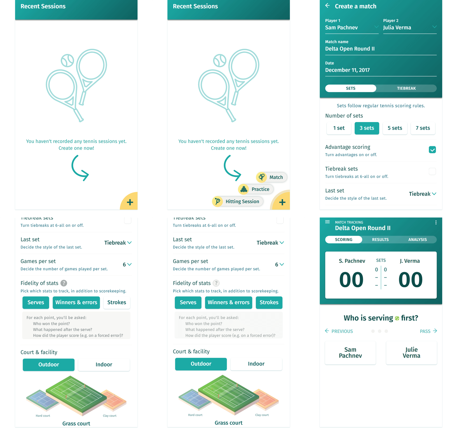
To meet our objectives, we implemented a statistics tracking and analysis prototype that records score and critical details, such as errors, winners, service percentage, etc. There are four parts to the experience: 1) match creation, 2) score-keeping, 3) viewing play-by-play results, and 4) statistical analysis. We address the issues found in our research (more detailed process below), and conducted numerous user tests between our iterations to refine usability and overall experience.
Below are screenshots of parts of the experience of our final prototype. Take a look at the breakdown of our final prototype.

Research Process
Competition (Software only)
Interaction time is critical for our design; the match is being tracked live by the user and any delay where the user hesitates is a chance for them to miss a point (causing an error). Of the three competitors we analyzed, the following heuristics jumped out as potential problems:
- Match between system and the real world (Mental Model)
We need to keep in close line with the audience’s mental model to make sure they can maintain full concentration on the match and only glance at our application. - Helping users recognize, diagnose and recover from errors
Due to the live nature of recording statistics, an error can grind all progress to a halt and invalidate the data. - Visibility of system status
The user must always be aware of the system status. It means fewer errors and fewer errors means more accurate data. - Flexibility and efficiency of use
- Recognition rather than recall
Users must be able to relearn tasks through recognitions, since tools like statistic trackers are not used daily. - Help and documentation
Context
Knowing exactly what is losing points during a match is critical to a player’s improvement. Understanding what strokes, mental states and/or energy levels contribute to their success or failure can help unveil the next steps to improvement.
For our competitor research, we found existing statistic apps unseemly and hard to use, either from no onboarding or a lack of understanding how a player approaches the tennis scoring system.
To break down the pain points of current tennis statistics-tracking software, we created three personas for each of our audience types: a competitive high school tennis player, Sam Pachnev; the tennis dad, Greg Pachnev; and the full-time coach, Brandon Muamba. The journey map shows the opportunities for UX to aid their tennis performance and coaching to reach another level.
Journey Map

Implementation Process
The statistics feature we implemented and prototyped allows users to keep track of scores and critical details, such as errors, winners, service percentage, etc. There are four parts to the experience of score-keeping: 1) match creation, 2) score-keeping, 3) viewing play-by-play results, and 4) statistical analysis.
Sprints & User Testing
Within three design sprints, we created various prototypes, conducted numerous user tests, and refined our designs based on feedback. We brought our prototypes into the field, testing them with experienced coaches and tennis teams at SFU and UBC. Particular issues we discovered and addressed along the way include: an unclear score-keeping process that wasn’t straightforward/fast enough for live-recording, the colour palette and font choice wasn’t well suited for bright-light conditions (outdoor tennis scenario), and confusing statistics breakdown.
As our sprints progressed, our prototypes and ideation include excel spreadsheets of manual tennis score-keeping, sketches of the proposed score-keeping feature, and static-page prototypes. The final prototype is coded with HTML, CSS and JS to better reflect the interactions and nature of the desired experience.


Final Design Breakdown
In our final prototype (interact with it above), we created a functioning browser interactive prototype to reflect our desired functionality and experience. A static high-fidelity prototype only tells us half the story – added animations and complex interactions draw a better picture for how the design performs.
Visual Design & Readability
Ensuring high contrast between test and UI elements during scorekeeping was a priority, as we knew from research that the design needed to be used outside on bright sunny days – optimal conditions for tennis. We tested our colour palette and colour-contrast under bright light, and picked a font with distinct letter forms for ease of reading.
Match Creation
With match creation, our goals were to: 1) maximize the clarity of the interface, and 2) guide first-time users through the process without hindering advanced or frequent users in a tool that is considerably feature-rich compared to its competitors.
The stat fidelity selector allows users to select the statistics they would prefer to track. A small, unobtrusive icon next to the option heading reveals the resulting state of the system in a tooltip.

Score-Keeping
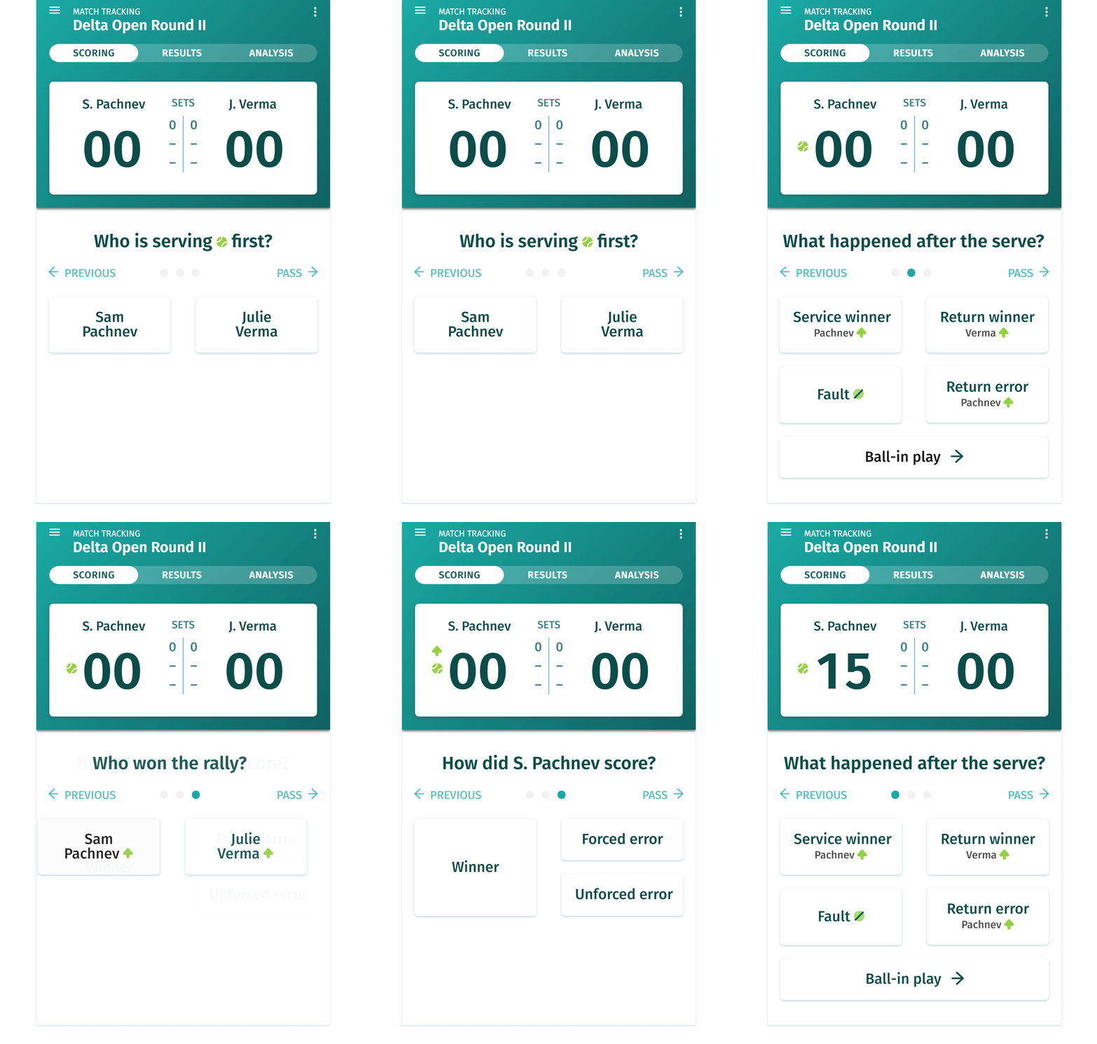
Scorekeeping is the bread and butter of our design as a smooth, easy-to-learn and easy-to-recall input system. A user can be sitting on the side of the court for three or more hours. If inputting points is tedious and mentally draining, then tracking the score and higher-fidelity stats for an entire match becomes a chore.
To combat difficulties with user fatigue, we introduced a question-based interaction experience. This streamlines statistical input, reduces mental strain and shortens interactions with the app. Animations bring attention to changes in the state of the score tracker as they simultaneously watch the match.

Match Results
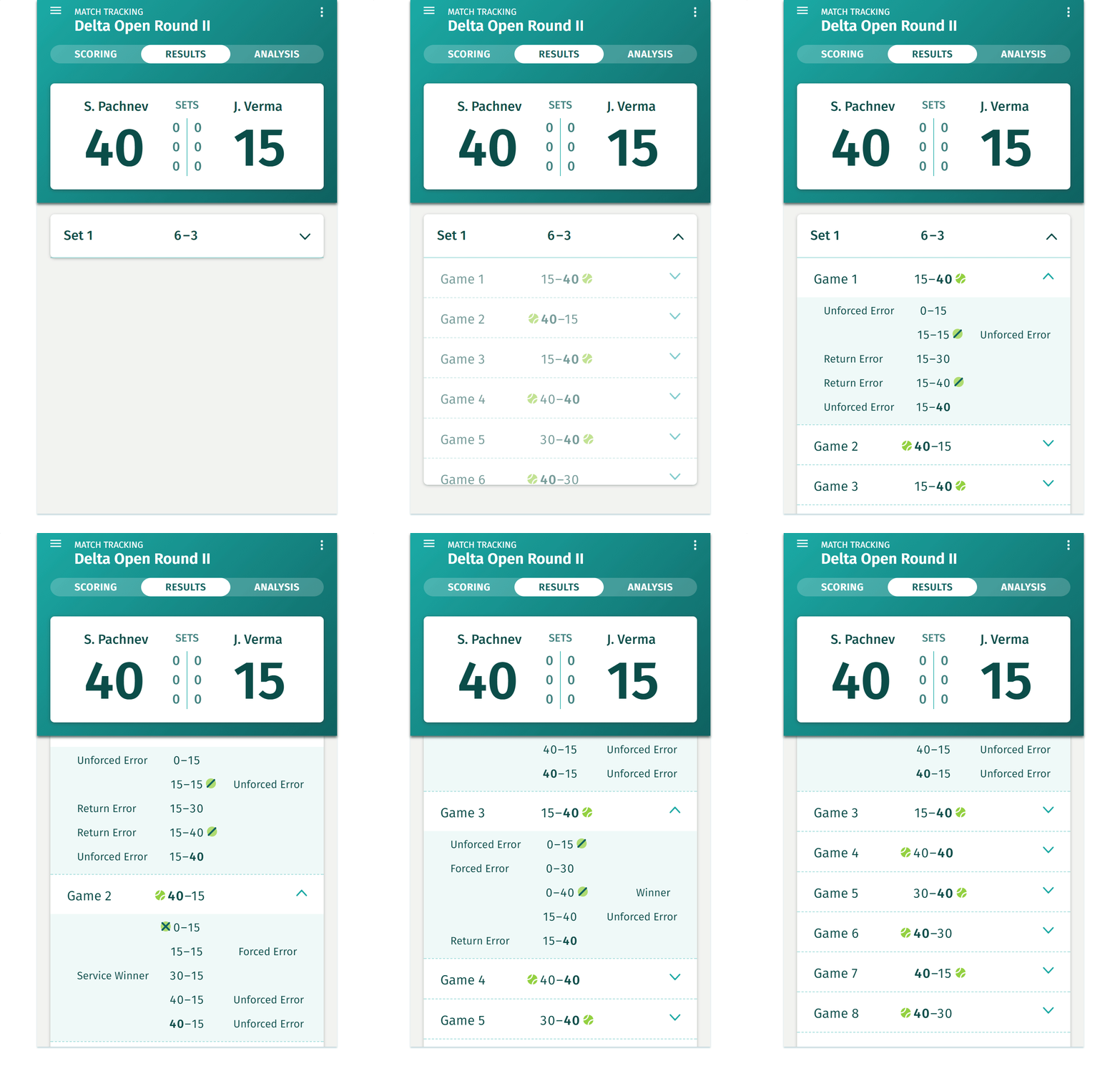
The Results tab offers a valuable play-by-play view of the match, summarizing every point and how they were earned. Users can expand or collapse the multi-level list view, progressively disclosing highlights from each game of every set. Animations and consistent visual cues (via icons) aid in the quick understanding of the at-a-glance information.

Statistics Analysis
From the statistical analysis, a coach or player can review the match and assess how the player performed.
We compare players to one another using bar chart comparisons. If a user wishes to understand how any of the stats were calculated, they can tap on any label or bar to show a tooltip explanation.
To access a stronger breakdown of how one of the players played, the user can choose the player they wish to analyze in the tabs. Here, the user sees a player-only break down of the statistics and some additional graphs to understand how that player performed.

